The Road to Refreshing Your Website
Posted on June 19, 2020 Ayesha Lamons
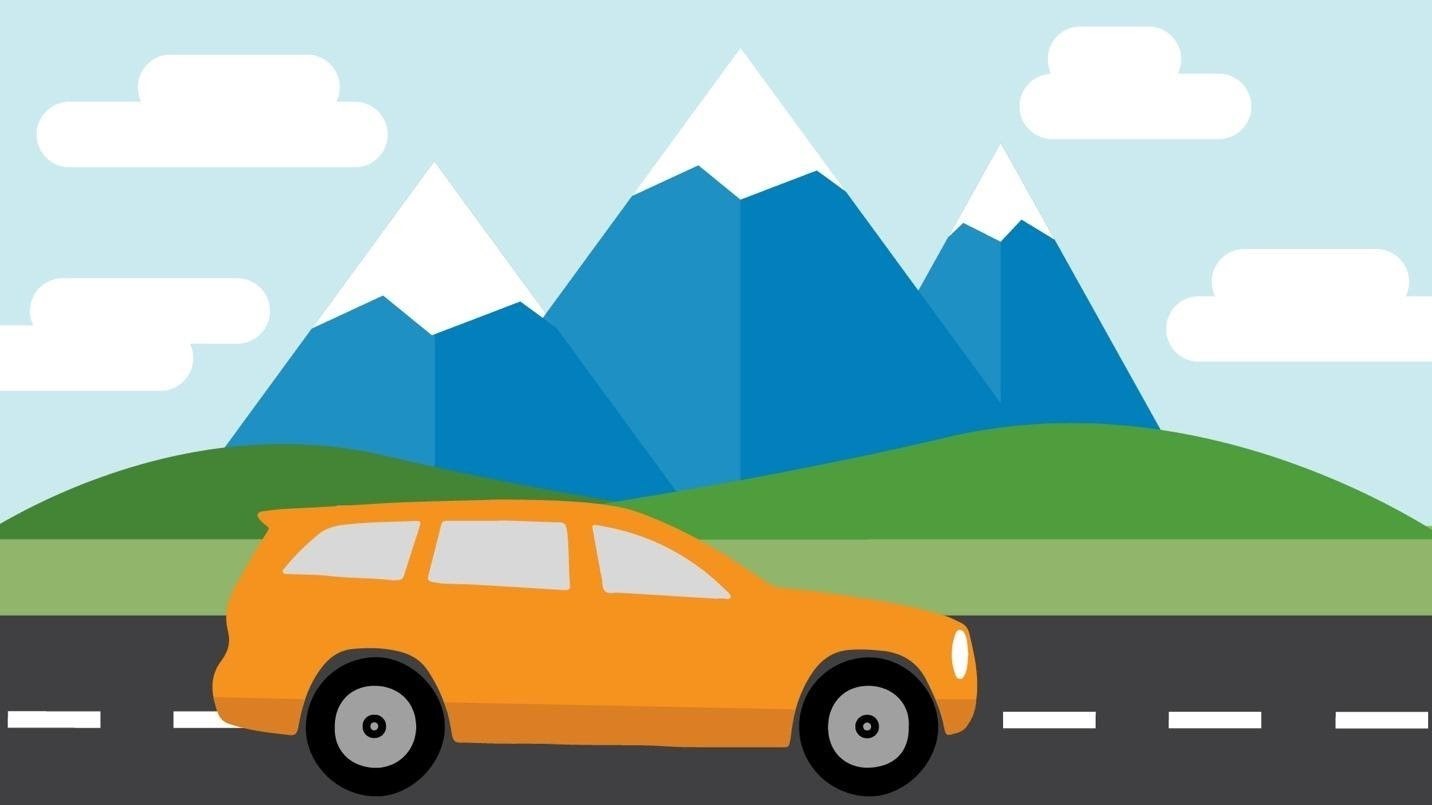
If you want to change your website—but a complete redesign isn’t in the budget—the NERDs have a solution for you! A few minor content updates can have your outdated website looking as spiffy as a brand-new car. Without regular updates, your online presence could potentially suffer.
Websites are similar to automobiles. They need regular maintenance to keep running smoothly. If you don't give your site proper care, you'll notice it will give you more problems in the long run. A complete redesign might not be necessary, but some updates could possibly help increase conversion rates with a website refresh. Here are a few pit stops you should make so your competitors don’t leave you in the dust.

Step 1: Enrich Your Copy
Your website needs to have copy that’s intriguing and understandable to keep your visitors on the right road. If the user is confused by your business lingo or inconsistent brand language, they will have their doubts about your company. This is a horrible way to start off a business relationship, so don’t let that happen! Update your copy soon and keep these little tips in mind:
Find Your Company's Voice

Nerd Lingo: Brand Language
Definition: Words or phrases that an organization uses to describe their overall values and services/products [Wisegeek].
First off, figure out your brand language. It needs to be recognizable by your clients or customers because they are who you’re trying to engage. After pinpointing your brand language, keep it consistent on all pages of the website. Your goal is to keep the users on track and avoid any detours.

If you’re struggling with your brand language, it might be time to figure out who your customer is by looking at web analytics or simply by asking them questions. The more you know about your user, the easier it is to write copy for your website. It’s like selling a car—if you find out your customer has three little kids, you wouldn’t start by showing a fancy convertible. You need to speak to their lifestyle in order to grab their attention
Reduce, Reduce, Reduce!
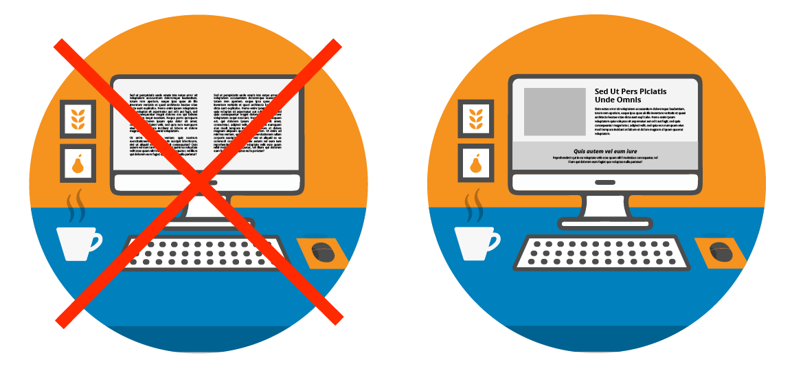
How many times have you seen a wall of text on a website and felt overwhelmed by it? This is common and can often result in one of two scenarios: the user might take a glance at the wall of text for a few seconds and then decide to leave your site, or they might skip over important information. Keep your copy short and simple by eliminating unneeded text.
Get to the Point With Hierarchy
Nerd Lingo: Hierarchy
Definition: “A system of organization that places elements in an order that implies importance.”
Another way to achieve a cleaner look with your copy is to apply “Hierarchy.” Applying different heading styles and sizes will help your customer easily navigate your site and direct them to information that is important to them.

Step 2: Update Visuals
Now that your copy feels fresh, it’s time to work on your visuals. Visuals are anything that add to the “look and feel” of your website, like graphics, icons, photography, textures, or patterns. Just like a sleek paint job, all of these visuals need to be cohesive and represent your overall brand.
Say "no" to cheesy stock photos and "yes" to saying cheese!


Stick to your brand by adding custom photography. How many times have you seen a photo of a person in a business suit holding a plant to represent “growth”? Stock photos can be awkward and overused. Stand out from the crowd and give your client/customers a peek of your office and who you are.
So, maybe it’s time to set up a photo shoot. You can hire an agency to do so, or just get out your camera and take a few shots on your own. If your budget is tight, you might opt for the latter.
Appropriate use of stock photos
If custom photos aren’t in the picture and you’d rather use stock photography, there are great online resources to purchase or pull from. If you want the best of the best, you might want to check out Shutterstock or iStock. Some good free online resources would be Unsplash, Pixabay, StockSnap.


Graphics & icons will do
Having trouble finding photos that follow your niche market? Maybe try creating branded graphics or search for icons to give your online visitors a break from that wall of text we talked about earlier. Here are some tools to help out with this. The Adobe Creative Suite programs such as Photoshop, Illustrator, and InDesign are great design resources, but the subscription isn’t cheap. If you want something that is free to use, Canva is a great online tool. If you’re in the need of icons, check out Font Awesome, Flat Icons, and many more free icon resources here.
Patterns, textures, colors, OH MY!
Important areas on your website might need a little more love and attention to pull in the users. Try drawing attention with background patterns, textures, and blocks of colors. Here are some websites that can help with that:
Free resources:
- https://www.transparenttextures.com/
- http://thepatternlibrary.com/
- https://www.toptal.com/designers/subtlepatterns/
- https://uigradients.com/#DirtyFog
- https://unsplash.com/t/textures-patterns

Step 3: Rethink Your Layout
Love your content but still see low conversion rates? It might be beneficial to rearrange the order of your content to help guide the online visitors to certain areas of your website. The best place to start is the homepage.
Welcome to the Homepage
Look at your homepage and ask yourself what you want to accomplish. Is it to make a sale, get a call from a potential lead, or simply to inform the user about a certain topic? Once you figure that out, think of ways to display your content to achieve your goal.
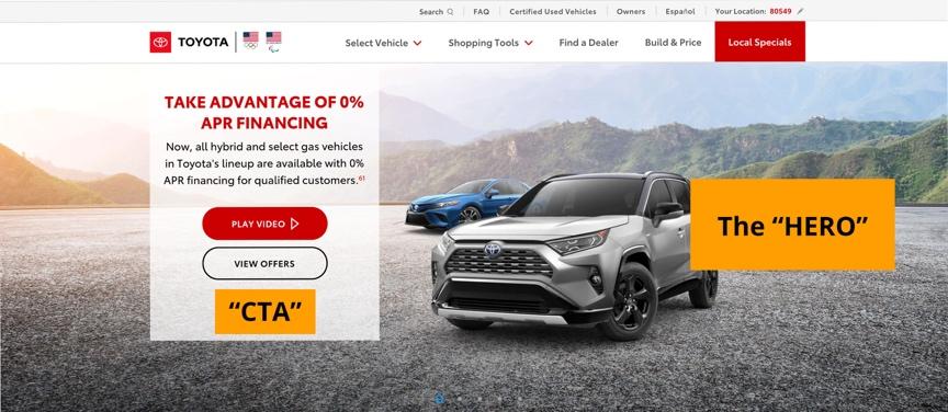
Nerd Lingo: Hero Image/block
Definition: The first, main photo or graphic that you see at the top of a web page or email [Wordstream].
The “Hero”, which is usually the first content to be seen when you land on a website, is a great place to draw in the user. Imagine walking into a car dealership. It’s common to see a beautiful, shiny car parked front and center of the showroom. The placement of the car is intentional, to “wow” the customers. They might not purchase that specific car, but it can keep them excited enough to look for another one. The Hero plays the same role on a website. It’s important to add intriguing content to the Hero block to keep the customers from leaving the website.
Now that your visitors are hooked, ask yourself which pages would you like them to see? That’s important to know because you want your client to easily navigate to those specific subpages from the homepage. Maybe your blog is important, so make sure you have your most recent post displayed somewhere on the homepage. If your site is strictly eCommerce, try putting a block that shows your best-selling products or products that are on sale. Laying out your homepage with purpose will potentially guide your customers and clients to make a phone call, fill out a form, or even purchase a product or service.
Call to Action
Definition: The part of a marketing message that attempts to persuade a person to perform a desired action [Marketingterms].
For many websites, one of the most important blocks to have would be the “Call to Action” or in NERD terms, the CTA. In my experience, the CTA is great to have above the footer on almost every page. You want the online visitor to look over the copy first and then give them a way to reach out or take a next step. For users that have already visited your website, add buttons in the header or in the Hero block to make sure it’s quicker for them to take action, instead of them having to scroll.

Make sure your links and buttons are working on a weekly basis.
Put the Pedal to the Metal!
Yearly content updates are important, especially if you want to have higher conversion rates. So, rev your engine and buckle up, because this digital world is fast-paced, and you’ll need to make sure you’re ahead of the crowd.
We hope these tips are a useful map and will help you identify missed opportunities. If you’re having a difficult time with these content edits and your site has more fixes than you can handle, reach out to the NERDs. We are happy to help.