Minimum Viable Brand: Foundational Strategies for Brand Building
Posted on January 08, 2021 Mary Merritt
Let's take a moment to talk about what "Minimum Viable Brand" means, and why it's so dang important for every business to meet these minimum requirements. We know, we know... the word "BRAND" has almost lost its meaning at this point! We promise: this article breaks it down in a realistic, simple fashion. Read on!
So... what the heck is "Minimum Viable Brand?"
Minimum viable brand is not unlike "minimum viable product," or "MVP."
When you hear the term "MVP," you probably think about amazing athletes like Patrick Mahomes or Aaron Rogers. In our world, the term "MVP" stands for "minimum viable product." A product "MVP" outlines the minimum requirements needed to launch a product into the world. Instead of building all of these bells and whistles right off the bat (in a vacuum), a SIMPLE version of the product is created in order to launch. Then more functions and requirements are added to the product once the concept has been "proven" (meaning: there is a market for the product and that market likes what you have put together for them).
Well, minimum viable brand or "MVB" is pretty similar. The word "BRAND" means so many different things to so many different people that it has somewhat lost its own definition. However, the term "MVB" really outlines the minimum requirements that a company needs for its brand identity. We'll go through each requirement below! Remember, this is the NerdyMind take on MVB — so some of this is subjective!
First things first: do you know your customer groups?
Building a brand is usually the step you take after doing some deep, strategic thinking about your organization. For instance: Who are your customer groups? If I asked you to break your customers down into 3 buckets, what would that look like? Okay, now that you know your "customer buckets" — which one would you consider your primary bucket? What about your secondary bucket? Tertiary? Forcing yourself to think hierarchically about your customers will help you with your marketing and even your financial reporting (if you can believe it).
This simple exercise can help you:
- Design your visual brand language
- Tailor your branded messaging
- Figure out your website navigation/architecture/flow
- Model revenue
- And all kinds of amazing things!
Before you dive into creating your MVB, you should definitely think through your customer groups in detail. This will drive you to design visuals and create messaging that truly speaks to your audience. There is more to it than that, but understanding your customers, their challenges, their desires — it all helps you to create an MVB that your people will dig.
Your brand's mark (your logo) is pretty darn important.
We'll start here because a lot of people think that a brand is just a logo. It's been said a BAZILLION times by marketing and branding agencies all over the world, but a brand is so much more than a logo. However, the logo is definitely part of the MVB requirements.
This logo should have a few components to it. This could be considered subjective advice, but we're speaking from a few decades of combined experience, so hear us out:
- A font that has deliberation behind it. Using more than one font family in a logo will sometimes work, but we love it when people keep it super simple with one font family. This font should be used as headers and sub-headers on other marketing materials such as your website, your printed materials, and more.
- A strong "bug" that can stand on its own. When you can take the "symbol" part of your logo and isolate it and it still stands strong, you've done a great job. This isn't totally necessary, but the best logos in the world follow this guideline!
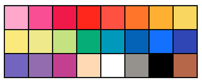
- A clean color palette. If you're using more than five colors in your logo/visual brand language, you might be overdoing it a bit. Of course, we've seen very successful brand implementations that have a LOT of colors... but those are few and far between. You know how they say that "THREE is the magic number?" We believe it. Our recommendation is usually to keep the color palette super simple with just three colors (plus black and white).
If you can create a simple branded mark that follows these guidelines, you're on your way to a solid minimum viable brand.
Speaking of fonts: don't use so many of them.
We know that your header fonts will likely be different from what you choose for your body copy (as an example), but this is why we ask that there is deliberation behind your logo font choices. It really "ties the room together" when you use the same fonts that your logo employs on all of your web properties and marketing materials. When choosing a font to use for your visual brand language, think of these questions:
- Is this a web-friendly, web-safe font? Some fonts are NOT. Additionally, you might design your whole brand around Century Gothic before you realize that it costs money to use that font (to purchase a commercial license). There are MANY amazing places to find fonts, from Google Fonts to Fontsquirrel.com. Just make sure that when you pick a font, it translates well across many mediums.
- How many WEIGHTS are in this font family? We LOVE using just one font family that has many different weights. Thin, light, regular, medium, bold, heavy, black — the foundation of amazing typography is to vary your font weights and guide the reader's eye. Choosing a font family that has a lot of weights can give you wonderful variation while staying within brand standards.
- Don't use so many different font families. When you keep changing up your fonts, you're adding more and more variation to your visual brand language. Having consistent visuals makes a more digestible visual experience for people. It puts them at ease, and allows them to focus on your content and your offerings. Some call this "invisible design."
Speaking of colors: less is more.
Very similar to using too many fonts, using too many colors in your brand's visual language is just not cool. It certainly doesn't contribute to that digestible visual experience that we're trying to accomplish! Once you choose your simple color palette, you should ONLY use that color palette moving forward. On your website, on your PowerPoint decks, on your business cards, on your social media profile graphics, on your car wraps, on your display ads, on your menus... whatever the heck it is. When you choose those colors, make sure that you really love them, because you are going to be looking at them for a long time. Just a couple of tips on choosing your colors:
- Don't use too many, but use more than one. Need we say more?
- Invest in a Pantone color book. Start from a print standpoint and work backward from there. Trust us. If you choose your colors on a computer screen, chances are that it will look QUITE different when it is printed. By starting with a widely adopted color-coding system like Pantone, you can know what it will look like when it is printed AND what it looks like on your screen. Since everyone's computer screens are calibrated differently, colors will sometimes look more warm or cold.
- Know your Pantone numbers. Just memorize them! Make sure they are documented in your brand standards guide or your "brand book."
- Know your HEX numbers. This is just a 6-digit number for your web-based colors. It's based upon an RGB (red, green, blue) system because those are the colors that create what you see on your computer screen. You should have these in your brand book, too!
- Know your CMYK breakdown. This is just a good measure, but make sure you also know how your Pantone colors break down into cyan, magenta, yellow, and black. This isn't TOTALLY necessary, but it's nice to have. CMYK is what is used to print in the 4-color process, by the way. Having these numbers in your brand book is great form.
Your brand messaging is really important, too.
Do you remember when we were talking about customer groups? Well, crafting custom messaging for each of these customer groups is just awesome. Messaging is another word that means a lot of things to a lot of people (when we say "messaging," what do we MEAN exactly?). To build a messaging platform that fits into your MVB, we think the following items should be considered:
- A strong tagline. You should have versions of your logo with and without your tagline. The best taglines have been cut in half, then cut in half again, then cut in half again. Short and sweet and to the point. Again, who is your customer? Should it be silly and humorous? Should it be serious and dry? Are we trying to target engineers and scientists? Or are we trying to target creatives and designers? This is why customer groups are so important.
- Some elevator pitches. You can make a different one for each customer group, but an elevator pitch is usually very short. We normally like to make three versions of an elevator pitch: 1 floor, 10 floors, or 25 floors (using the time in the elevator as our length indicators). Basically, we think making a short, medium, and long elevator pitch is a great resource to have in your brand book.
- A mission statement. This is about your existence and who you serve. It's a great time to show your customers that your values line up with their values.
- "About Us" copy. This should be used on your website, social media platforms, LinkedIn profiles, and everything above and below.
Keep your messaging simple at first! Don't fall down the rabbit hole quite yet. Remember, we're thinking about the minimum requirements needed to launch your brand. You can always add more bells and whistles to your brand after you've got it out there and you've seen a good response. It also allows you to see how your target audiences are reacting to your brand, which might reveal that you have to make some adjustments and tighten the screws in a few spots. It's all quite fun, really!
See? A minimum viable brand isn't scary at all.
There you have it! And believe it or not, you're likely ahead of the game if you follow these simple guidelines. We've seen established companies pulling $25M in revenue per year missing some of these items, so it isn't only for businesses that are trying to launch. Some companies grow so quickly and so organically that these things get overlooked. That's okay! And quite a good problem to have, frankly.
We hope this guide helps you think through what your MVB looks like! If you're missing anything from this article in your brand, take some time to work with your team and get it to a better place! We know you can do it.